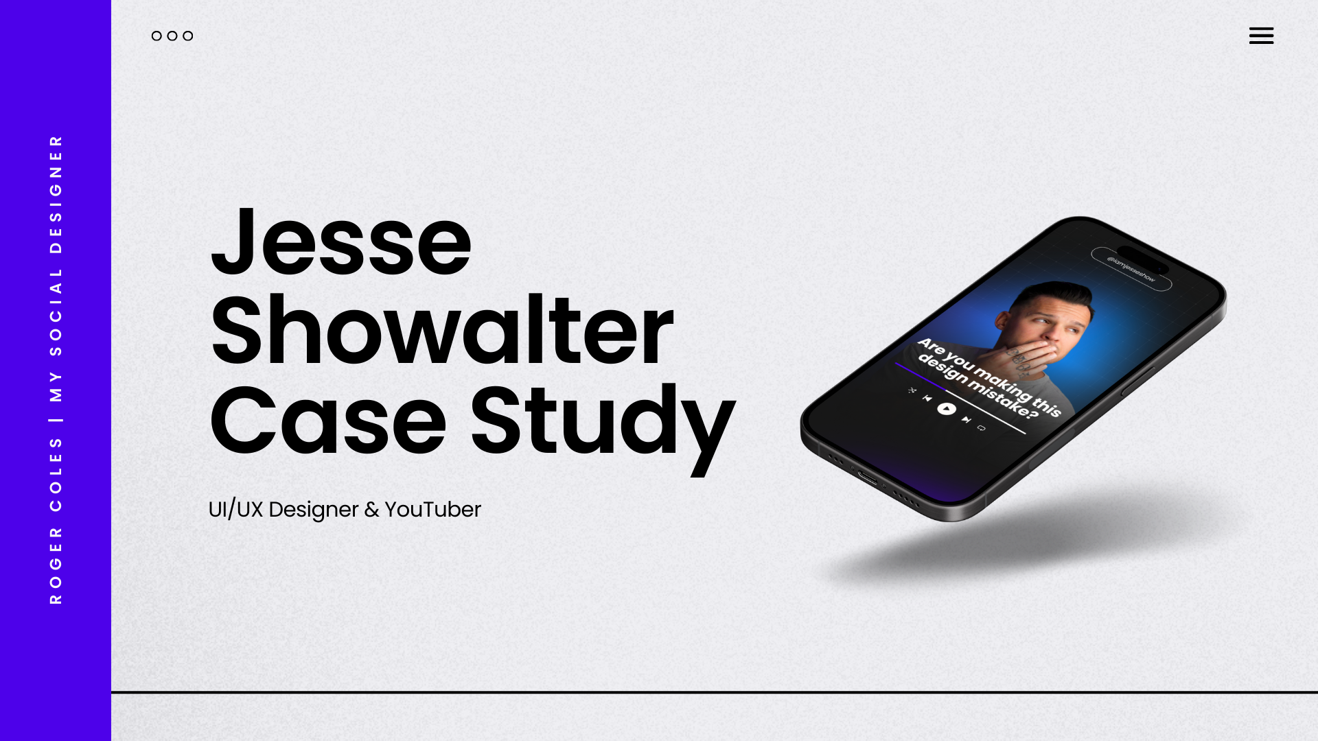
Jesse Showalter Case Study
There are dozens of memes saying some variation of “real designers don’t use Canva”. But that simply isn’t true anymore and it’s time to bust that myth. So stahhhp itttt.
In this case study I team up with my mythbusting buddy, Jesse Showalter, as we prove to the world that Canva can have a place in a designer’s toolkit.
Jesse is a UI/UX designer and asked me to help build a library of Canva templates he can use on Social Media. And you KNOW I answered that call!
UI/UX Designer & YouTuber
Jesse Showalter, is an incredible UI/UX Designer and YouTuber. He’s worked with companies like Apple and has an incredible course teaching others how to start their UI design careers. He reached out in hopes of revamping his social media presence.
Jesse's primary concern was his social media posts did not reflect his branding, and in his words, the overall look felt "cheap and cringey." He expressed his desire for a cohesive and professional look that would reflect his work and personality.
It was also important to have templates for producing social media content fast and inviting his team to edit and post.
Discovery Call Notes
During the discovery call, Jesse outlined the specific changes he wanted to see in his social media content. He felt like his current posts seemed random and didn't align with his existing branding.
He emphasized the need for new elements that would reflect his expertise in UI design, such as screenshots, gradients, and grids.
Thankfully, Canva has loads of those elements in the library for me to play with. Yippee!
Jesse also expressed his desire for a mix of content formats, including carousels, reels covers, quotes, and static posts. This diverse range of content would allow him to engage with his audience in different ways. And with these templates in place it would speed up his workflow.
The Designs
I created a mix of designs for Jesse to use across multiple platforms. Including thumbnails and banners for some of his upcoming interviews with guests.
Before & After
Before the design overhaul, Jesse's social media presence was already solid. But it did not fully reflect his brand identity. Each post was taking him time to create from scratch instead of using branded templates.
After teaming up, Jesse's social media channels have transformed. The posts now have a cohesive look, reflecting his expertise in UI design and aligning with his overall branding. The transformation is a testament to the power of good design and its impact on digital branding.
And proves that Canva designers and “traditional” designers can team up, make something beautiful, and live in harmony with one another. 😉
Have I convinced you that Canva is oh-mazing? If you haven’t tried Canva Pro, it’s worth a go. You can try it free for 45 days with my affiliate link here.
*Note - Certain links in this article are affiliate links, which means that if you click on them and make a purchase, I may earn a small commission. Rest assured, this comes at no additional cost to you and helps support me as a creator and small business owner.


